What no start menu?!
2011-10-05
With a big bang, the news hit home Microsoft killed the start menu. Ok the title of that slashdot post was a bit infalatory, but it is true, the start menu is being replaced by a start screen in Windows 8. The reason is? No one uses the start menu...
Maybe, just maybe it has to do smething with the fact that the Windows Vista and Windows 7 start menus are a convoluted mess? Maybe, just maybe, it has to do some thing with the standard way for applications to add links to the start menu? Let's look into the subject a bit deeper...
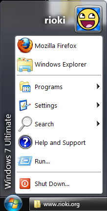
There are three things I do right after I installed Windows 7 (or Vista). I install a free anti virus software, I install a browser that is not Internet Explorer and I install Windows Classic Shell. Why? Because I can't stand the new start menu and I configure the menu to look like the simple Windows 95 version; with Aero skin.

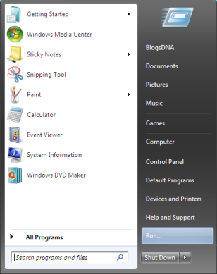
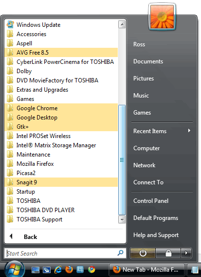
Let us look at the Windows Vista and Windows 7 start menu. It takes a strong inheritance from the Windows XP start menu, that had a number of "places" on the right hand side. The rationale was that people are incompetent to use an explorer and navigate to those locations. The left hand side has the programs, but instead of a simple tree of menus, the new version are foldable folders and icons. To top it off, since no one manages their start menu a search function is included.

The start menu has a number of issues. The first issue is the tiny space you have to look for your application. Manual searching is definitly not an options and you basically need to resort to use the search function. On a standard install, that lived a while you will definitly find nothing.
The second issue I have is places. Fine, I get the idea that there should be multiple access points for different users, but I never understood why they can not be a link in the rest of the start menu? The way this is solved in Windows Vista and Windows 7, there is no real way to add new "places". I am a developer, why not have a "My Source Code" folder?

The bane of the start menu, even with a classic start menu, are the way that programs install themselves in the start menu. Sure everyone is following the Microsoft gideline, but maybe this guideline was not such a good idea in the first place. The standard way to install a program is to put it under "Vendor Name/Program Name/Program Name". But in the same folder comes other stuff like a link to the uninstallation program, a link to the EULA, a link to the vendors website, a link to the manual (maybe, if they have one). The end result is that you have a convoluded mess, since you get many folders that have no real meanin; the applications could lie flat in the menu tree. (Especially when vendors cant decide what their real name is and you have two slightly different folders for two programs from one vendor.)
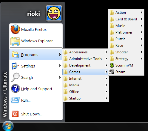
Maybe, just maybe it may help if the menu was structured a bit differenty, like say the way Gnome does it. (Ok, Gnome 3 does not have the Application Menu anymore, but the way they structure applications did not change.) Applications should not be grouped by vendor, but by category. My categories are Development, Games, Internet, Media, Office and Utilities. But that can also extend a level, down, I have so many games installed that I even have sub categories for the games.

The second issue is that each program adds a bunch useless stuff. The link to the uninstaller is useless, since "Add and Remove Programs" is way to remove programs from windows. The link to the manual is useless since, the application should have context sensetive help and anyway, what do you think the "Help" menu if good for? Links to webpages are useless, since I know what vendor I have the application from and in cases I am not sure, I use a search engine. The link to the EULA is obviously useless, since nobody reads that anyway. (For all layers out there, you could also have the same integration like manual; Help -> EULA.)
This situation is not aleviated by the fact that editing a start menu is really non intuitive. How meany people know that the start menu is a folder structure in your users directory. It especially does not help that the start menu is a blend of yours and all users start menu. I think Microsoft should have developed a utility that even your gandma can use or implement a sane structure, insted of fiddeling with the start menu and adding more wizzbang.
I use many programs regularly, the start menu is the way to go, since docking applications is just a pain when you have more than three. If the new start screen is really all the craze is a question left unawnsered.